Branding a Boutique Destination in Midtown Bozeman
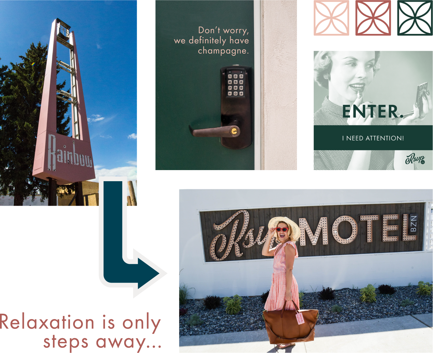
When a local family purchased the aging Rainbow Motel on North 7th Avenue, their goal was to breathe new life into one of Bozeman’s most storied streets. The property sat at the center of a planned revitalization effort for Midtown, an area poised for new development, restaurants, and nightlife.
The owners envisioned a stylish, boutique experience that paid homage to the motel’s mid-century roots while appealing to modern travelers. With two sisters leading the project, the concept took on a distinctly feminine, design-forward personality – one that would celebrate Bozeman’s creative energy and independent spirit.
THE CHALLENGE
The old Rainbow Motel had strong nostalgia value but little brand cohesion or appeal for the new generation of travelers discovering Bozeman. The owners needed a full transformation: a name, a visual identity, and a voice that would redefine what a roadside motel could be.
The challenge was to bridge eras – balancing vintage character with elevated style – and to create a brand flexible enough to extend to a future on-site restaurant.


THE SOLUTION
PRIME partnered closely with the owners to develop a brand as original as their vision.
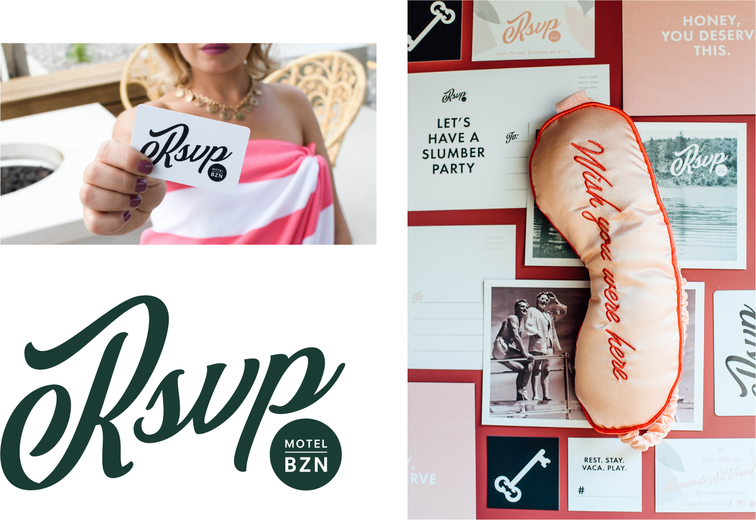
The name RSVP Motel captures the spirit of invitation—stylish, social, and a little cheeky. With French origins (an acronym for répondez s'il vous plaît), it feels feminine and playful, and takes you back to an era of personal, hand-written letters.
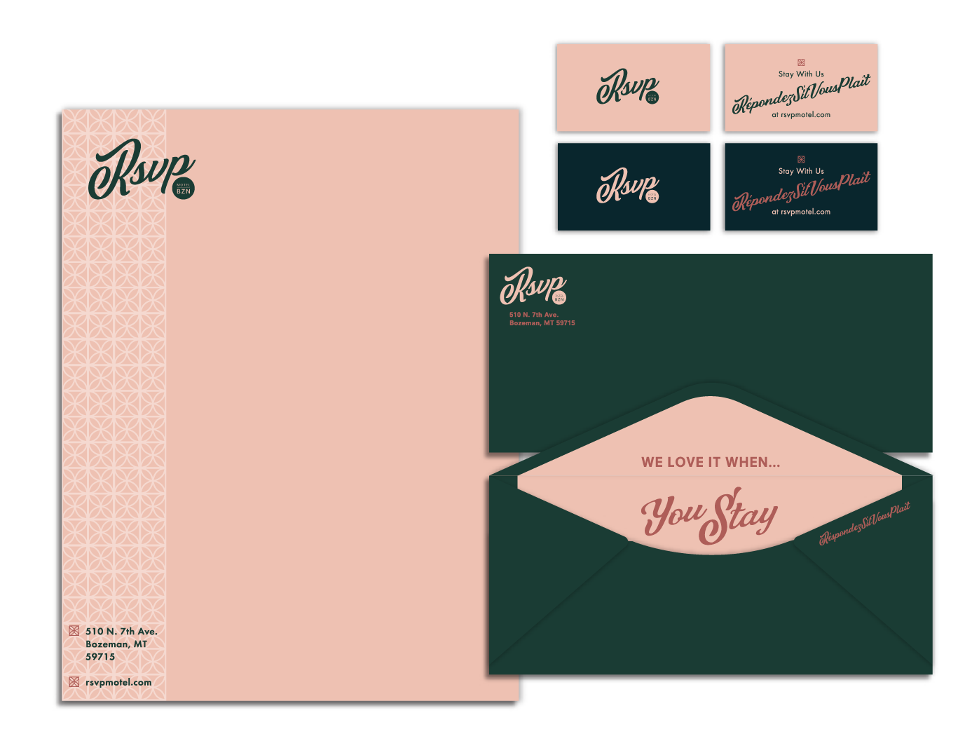
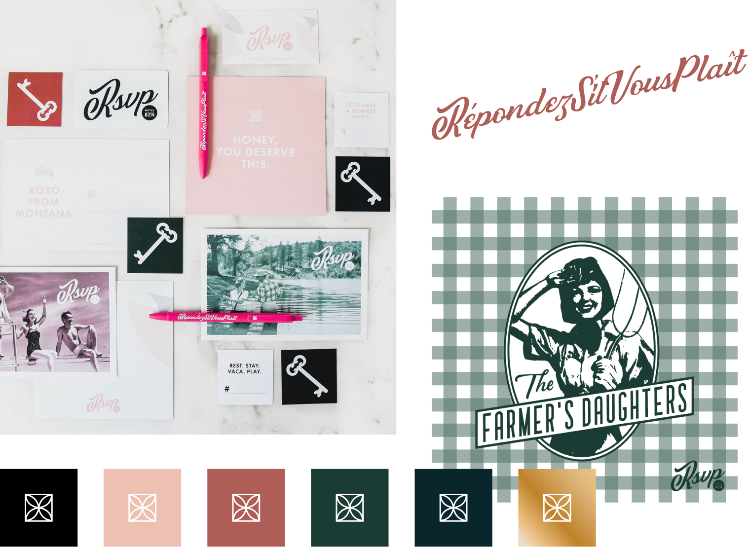
Next, we developed the visual identity, infusing it with a mid-century modern aesthetic softened by feminine details and a rich, vintage-inspired palette. The RSVP brand colors, including “Pretty in Peach,” “Cabana Red,” and “Roses Are Gold,” bring warmth and sophistication, while the Futura and Didot typefaces add contrast and character.
The concept extended seamlessly to the motel’s on-site café, The Farmer’s Daughters, for which PRIME also developed the logo and visual identity. The Farmer’s Daughters was named for the hotel’s two owners, sisters whose father was a local wheat farmer.


PRIME led the creative direction for signage, menus, room collateral, decals, and other touchpoints that guests would interact with during their stay. We also provided art direction for the new website and launched digital marketing campaigns to introduce RSVP to the Bozeman community and beyond.
THE RESULTS
The result was a standout brand that helped redefine Bozeman’s Midtown as a destination. The RSVP Motel quickly became a beloved local landmark—known as much for its playful attitude as for its polished design. Its café, The Farmer’s Daughters, now draws both visitors and locals, cementing RSVP as a gathering spot that bridges old Bozeman charm with new Bozeman style.
